There is a strange assumption in the photography world that if an image is bright, clean, warm, and colorful, it must be more joyful.
You see it especially in wedding and newborn photography. Bright white getting-ready rooms. Glowing nurseries. Warm skin tones. Pastel palettes. Open shadows. Images that feel immediately cheerful because everything has been lifted into light.
There is nothing wrong with that kind of work. Bright photography can be beautiful. True-to-color photography can be thoughtful and well done.
But somewhere along the way, many people started treating brightness as if it were the same thing as timelessness, and darkness as if it were only a trend.
That is not true.
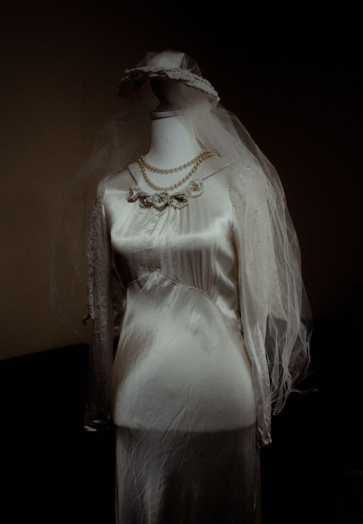
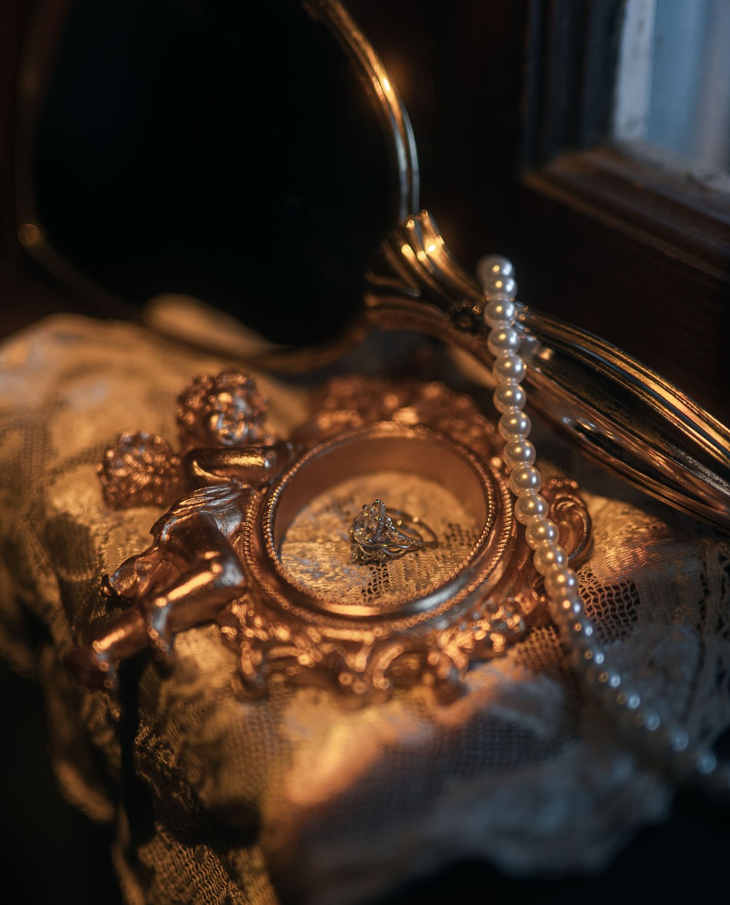
Darker images have been beautiful for a very long time.
Shadow has always had a place in art. Painters have known this for centuries. Filmmakers know it too. Depth, contrast, restraint, and atmosphere are not modern inventions. They are some of the oldest ways artists have drawn attention to what matters.
A darker photograph is not automatically dated because it is dark. A muted image is not automatically less truthful because the colors are restrained. A moody edit is not automatically hiding something. Sometimes it is revealing what a brighter edit would flatten.
That matters.
Because joy is not always bright. Love is not always loud. Beauty is not always clean and glowing and easy to understand at first glance.
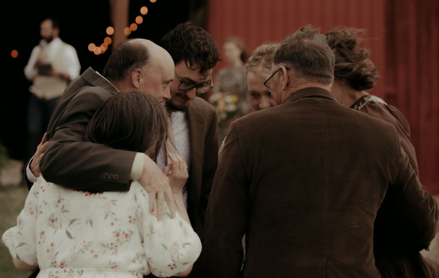
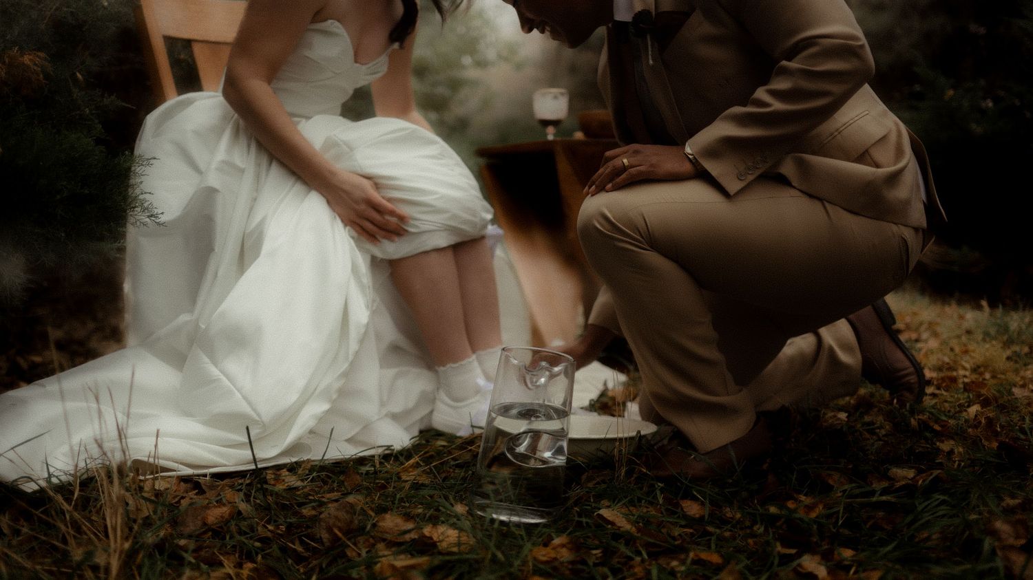
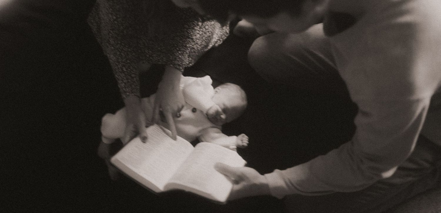
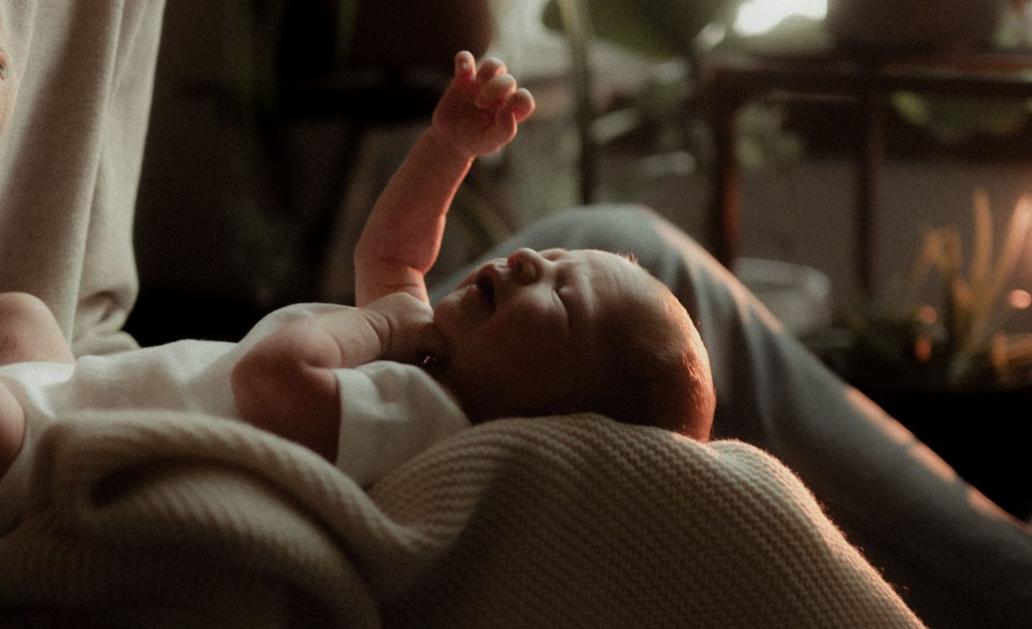
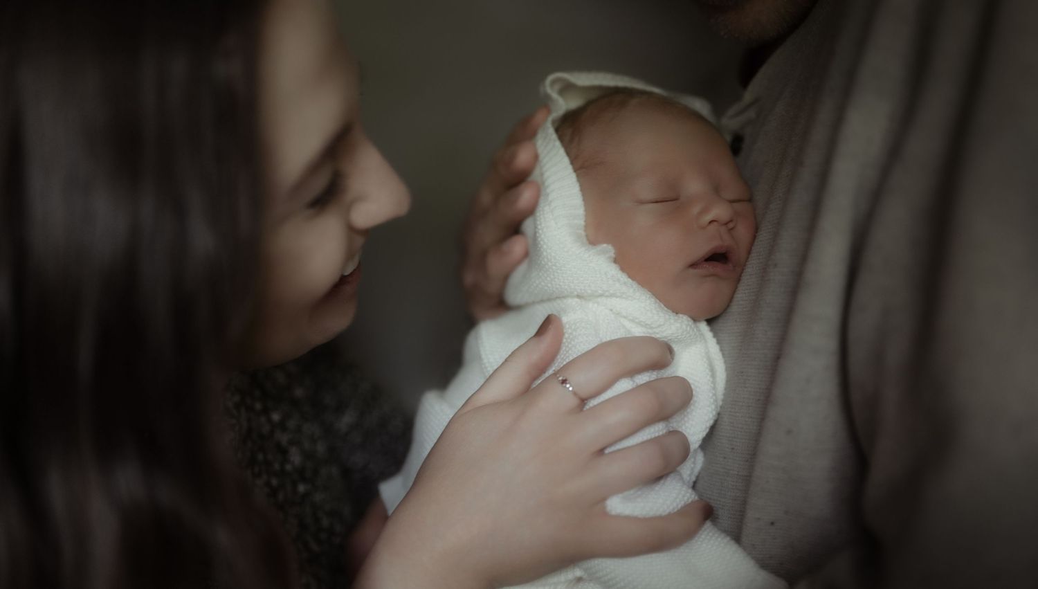
Sometimes joy looks like a bride standing in a dim church hallway with her hands shaking slightly before she walks down the aisle. Sometimes it looks like a groom crying under warm tungsten light because the weight of the covenant has finally settled on him. Sometimes it looks like a newborn curled against his mother’s chest in a shadowed bedroom while the laundry waits in the corner and no one has slept properly in days.
Those moments do not need to be scrubbed clean in order to be beautiful.
They need to be seen.
One of the gifts of dark and moody photography is that it often allows a moment to keep its weight. Not heaviness in a hopeless sense, but weight as in meaning. Presence. Texture. The feeling that something real happened here.
A bright edit can sometimes make everything feel equally important. The dress, the walls, the flowers, the skin, the background, the sky. Everything is lifted. Everything is visible. Everything is pleasant.
But shadow knows how to direct your eye.
It makes the light matter.

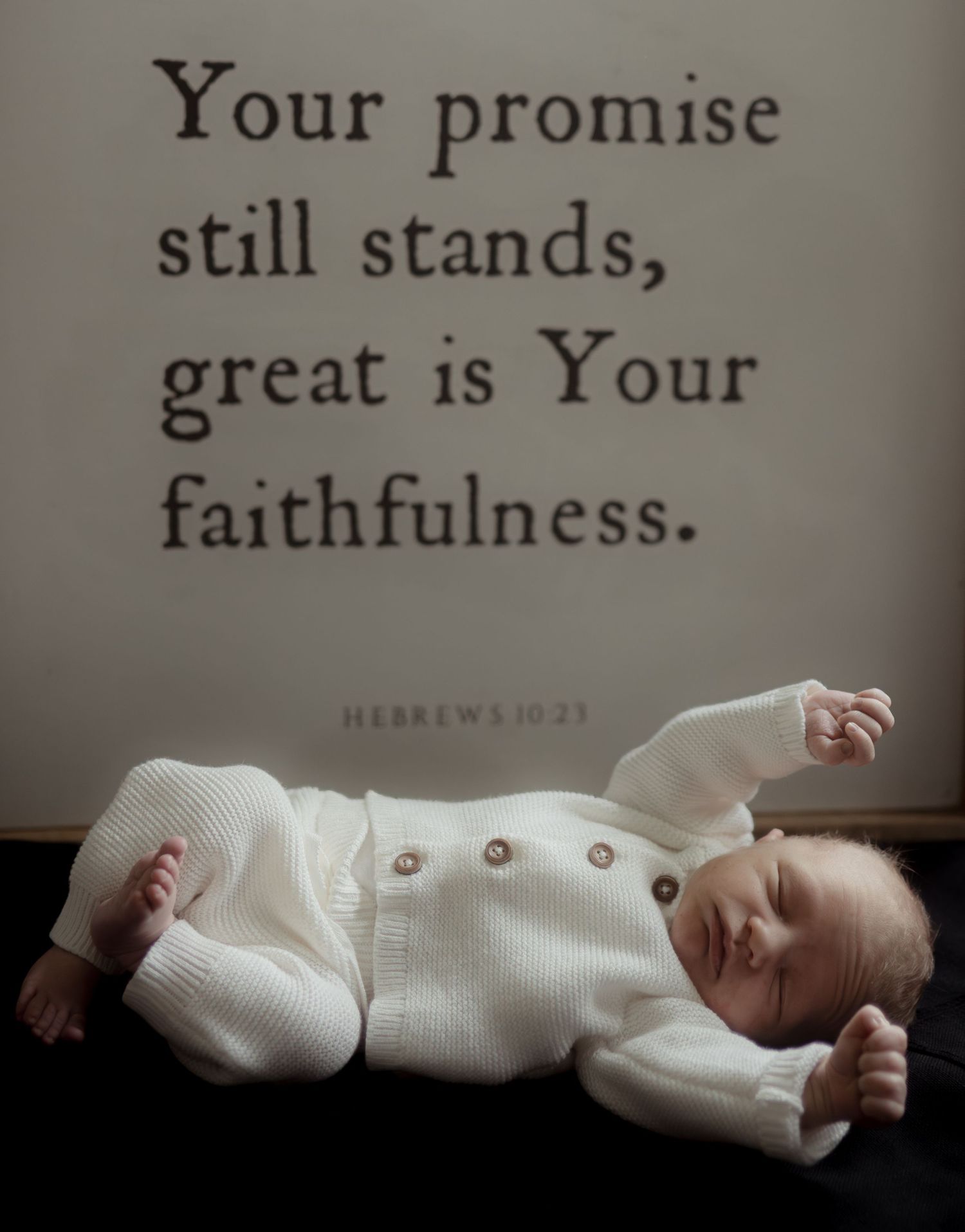

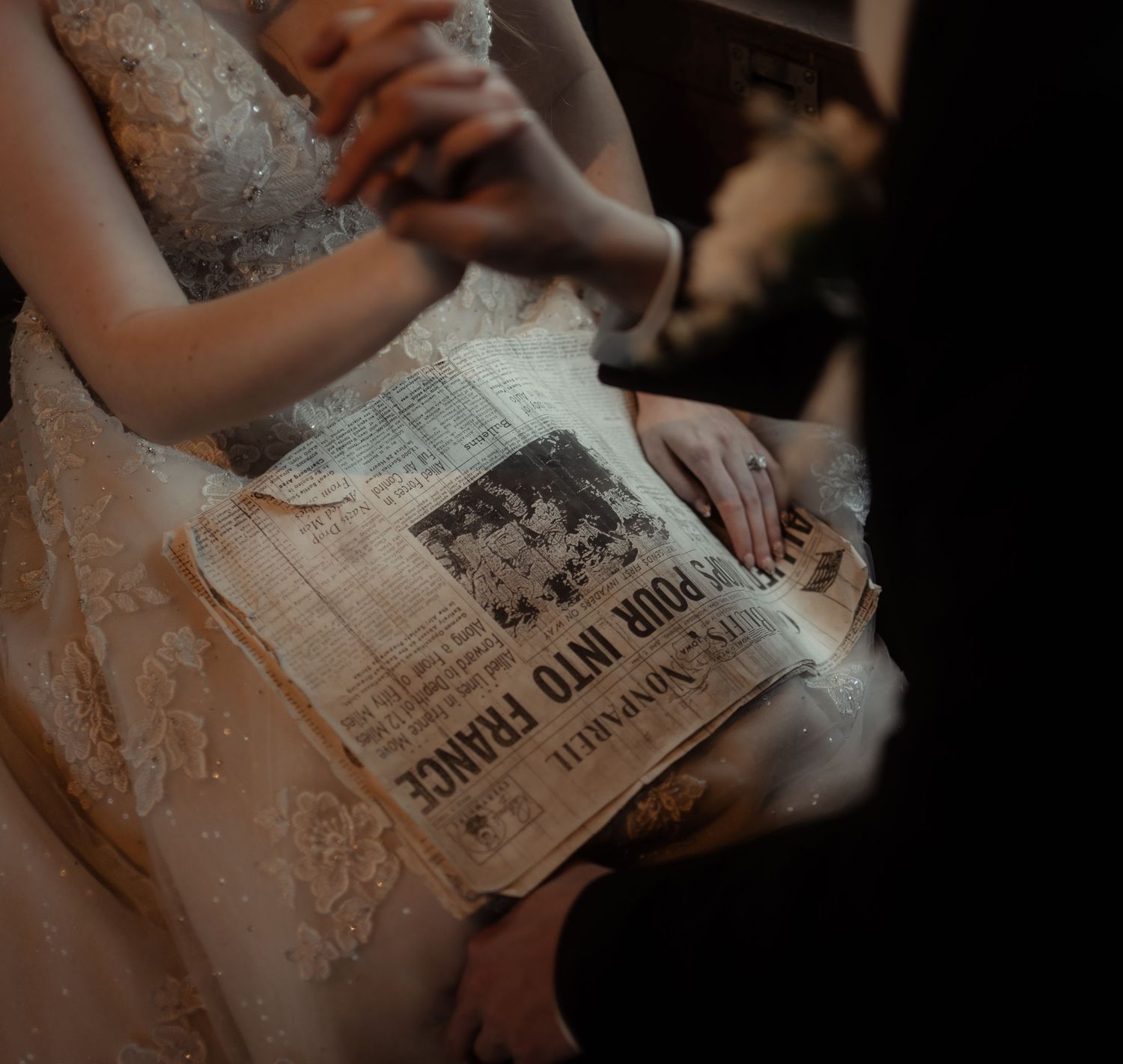
A hand reaching for a veil can become more tender because the room around it falls away. A mother’s face can feel more sacred because the edge of the window light touches her softly and leaves the rest quiet. A couple walking through rain can feel more cinematic because the gray sky, wet pavement, dark suit, and windblown hair are allowed to belong to the story.
Darker work often understands that light is not powerful because it removes darkness. Light is powerful because it enters it.
That is why this conversation matters for Christian photographers.
We do not believe beauty only exists where everything is bright, polished, and easy. We believe God works in the hidden places too. We believe human beings are image bearers in hospital rooms, cluttered bedrooms, rainy fields, dim sanctuaries, and imperfect reception halls. We believe joy can be present in exhaustion, reverence, longing, relief, and tears.
So our photographs should have room for that kind of joy.
Not every joyful image needs to feel sunny. Some joy feels like candlelight. Some joy feels like a quiet chapel. Some joy feels like the drive home after a wedding, when your feet hurt and your cards are full and you know you witnessed something more tender than the timeline ever could have planned.
There is a kind of photography that tries to make every story look like it happened in ideal conditions. The weather is softened. The room is brightened. The warmth is pushed. The shadows are opened until the image feels safe, pleasant, and familiar.
But not every story needs to be made more familiar.
Some stories are better honored with depth.
This is where the “classic” argument can become too shallow.
People will say darker editing is not timeless, that it is just a trend, that true-to-color work will age better. But classic does not mean bright. Classic does not mean neutral. Classic does not mean every image looks like it was made for a wedding blog in 2016.
A photograph becomes lasting because it is well seen. Because the light is intentional. Because the composition has strength. Because the emotion is honest. Because the image feels connected to the people, the place, and the atmosphere of the day.
A flat, overly bright image will not become timeless just because it is technically “true to color.”
And a darker image will not become dated just because it has mood.
The question should not be, “Is this bright enough to be classic?” The question is, “Did this photograph tell the truth beautifully?”
That is a harder question. It requires more from us than following the safest visual formula. It requires discernment. It requires restraint. It requires knowing when to preserve the dimness of a room instead of fighting it. It requires learning the difference between an image that is genuinely rich and one that is simply underexposed. It requires knowing when color should sing and when it should whisper.
Because yes, dark and moody work can be done poorly. It can become muddy. It can become heavy-handed. It can be used to cover weak lighting, strange skin tones, or a lack of intention.
But bright work can be done poorly too.
Brightness is not a virtue by itself. Saturation is not a virtue by itself. Warmth is not a virtue by itself.
A photo does not become good because the greens are lively, the skin is golden, or the whole frame feels cheerful at first glance.

A good photograph has to carry something.
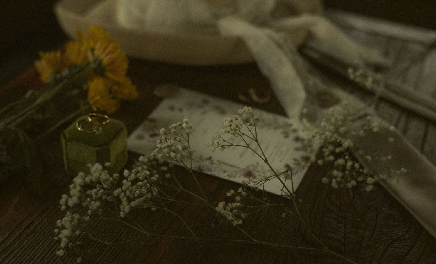
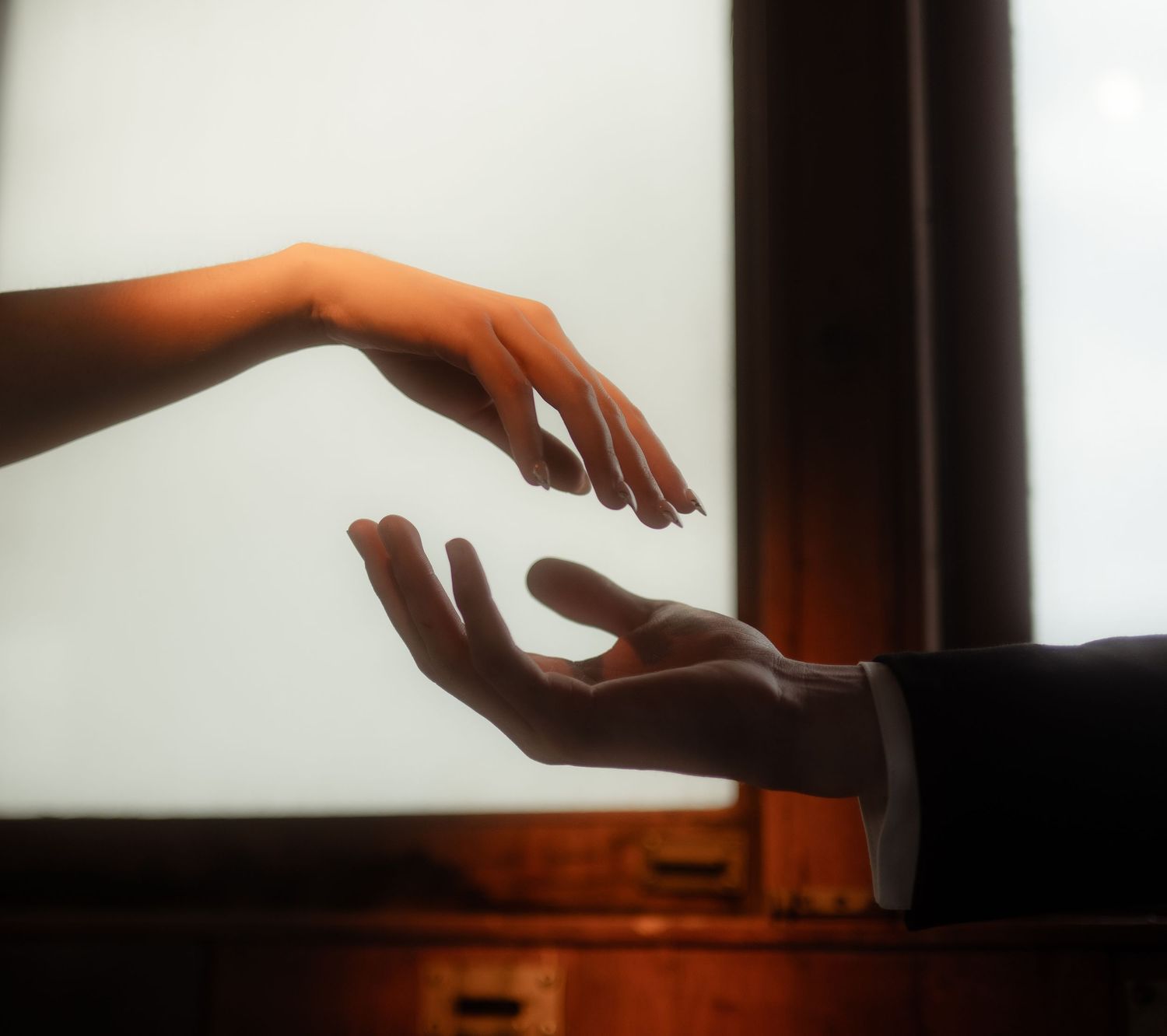
And often, darker photographs carry emotion with a kind of reverence that bright images do not always allow. They can hold mystery without becoming vague. They can make ordinary rooms feel painterly. They can turn a quiet glance, a wrinkled dress, a rain-soaked sleeve, or a hand on a newborn’s back into something that feels worth lingering over.
That is not a passing trend.
That is art.
When you look at older paintings, old family photographs, stills from films that shaped entire generations of visual language, you do not see a fear of shadow. You see artists using darkness to create depth, intimacy, and attention. You see faces emerging from dim rooms. You see hands lit more carefully than entire backgrounds. You see color restrained so that emotion can come forward.
There is nothing shallow or temporary about that.
And for photographers who are trying to honor Christ in their work, this should free us from chasing whatever the industry currently calls safe. We do not need to make every image bright enough to be approved by people who have confused visual cheerfulness with joy. We do not need to flatten the atmosphere of a wedding day because someone once said moody editing was “too trendy.” We do not need to apologize for making work that feels quiet, old-world, cinematic, painterly, or emotionally complex.
> We do need to be honest.
> We need to be skilled.
> We need to serve our clients well.

We need to make sure our preferences are not becoming excuses for laziness.
We need to care about skin tones, detail, print quality, and whether the people in front of us are being honored rather than swallowed by our style. We need to make images that are beautiful because they are faithful to the moment, not because they are performing depth.
But when the room is dim, let it be dim.
When the rain gives the day texture, let the rain stay.
When the nursery is quiet and shadowed, do not rush to make it look like a studio.
When the bride is laughing in low light with mascara slightly smudged and her bouquet slipping in her hand, do not assume the joy needs to be brightened to be believed.
> You are allowed to make work that feels like art.
> You are allowed to photograph joy with depth.
You are allowed to believe that a darker image can be just as celebratory as a bright one, not because it copies the visual language of happiness, but because it attends to the actual presence of love.
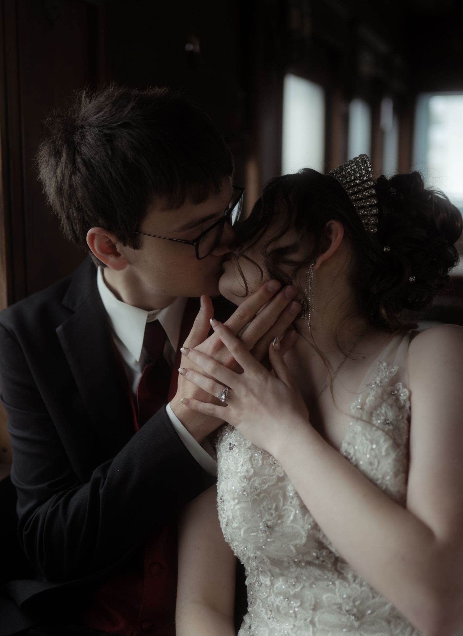
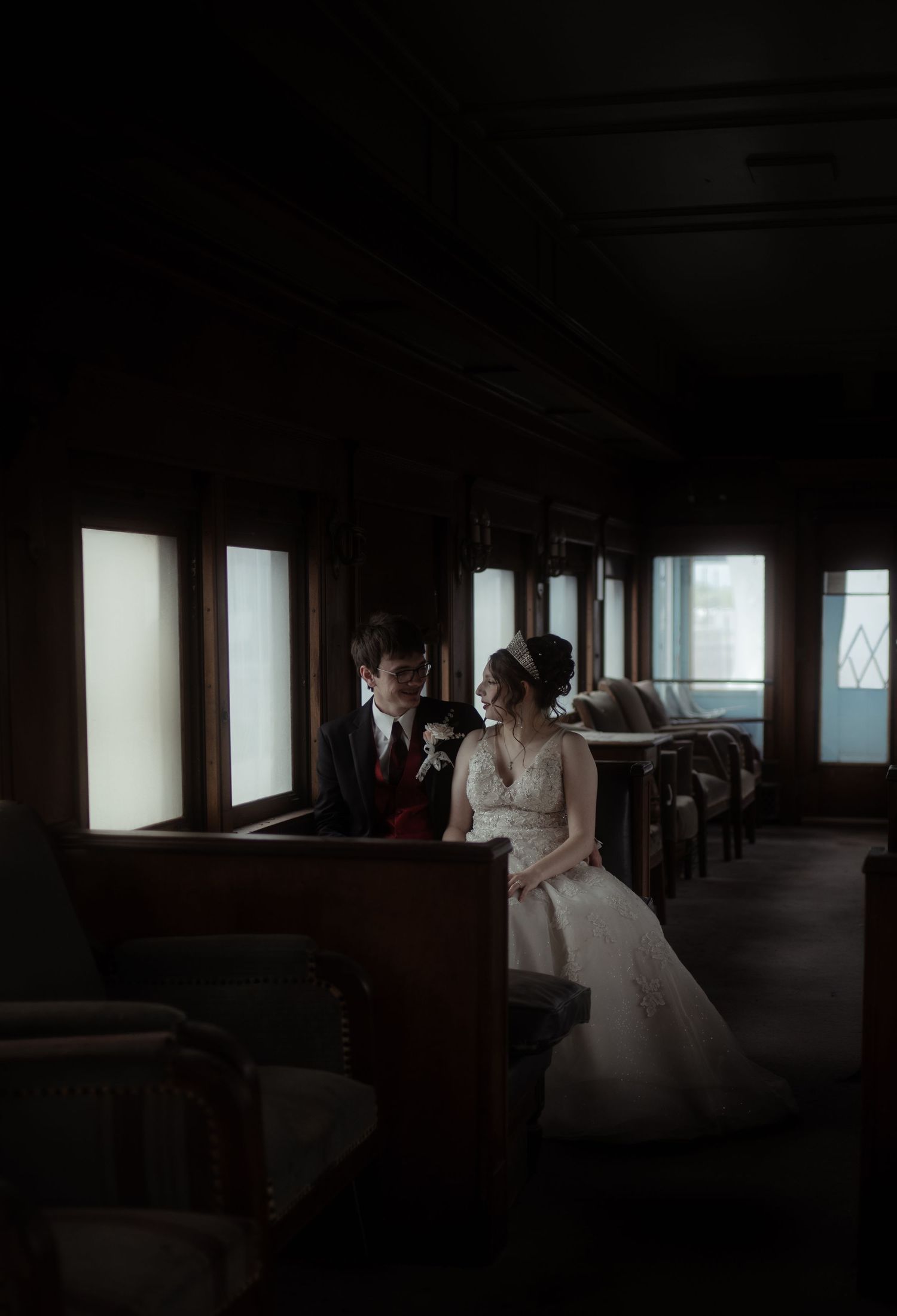
The world does not need every photograph to look the same. Your clients do not need their memories forced into whatever palette is currently being praised as safe, classic, or marketable. They need photographs that help them remember what it felt like to be there.
The hush before the vows.
The storm that rolled in.
The candlelight on the reception tables.
The baby asleep in the bend of an arm.
The laughter that happened in a room no one would have chosen for its lighting.
The joy that was real even when the shadows were real too.
That is worth defending.
Not because dark and moody photography is better than every other style, but because it has been unfairly dismissed by people who have mistaken brightness for honesty and popularity for permanence.
Joy does not belong to bright images.
Beauty does not belong to clean white rooms.
Timelessness does not belong to one editing style.
And light, when it is handled with care, often becomes most beautiful when it has somewhere dark to land.
“The light shines in the darkness, and the darkness has not overcome it.”
— John 1:5